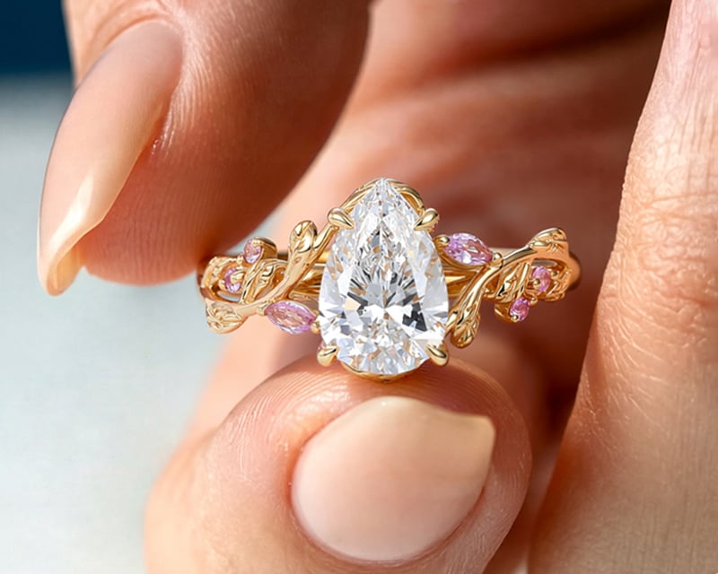
The Design Details Most People Overlook When Choosing a Ring Setting
0 comments
SHOP BY STYLE ✧
SHOP BY SHAPE ✧
![]()
![]()
![]()
![]()
![]()
METAL COLOR ✧
WEDDING BANDS
SHOP BY STYLE ✧
![]()
![]()
![]()
SHOP BY STONE ✧
SHOP BY METAL ✧
JEWELRY FOR THE BIG DAY
NECKLACES ✧
EARRINGS ✧
BRACELETS ✧
Engagement ✧
SHOP BY SHAPE ✧
![]()
![]()
![]()
![]()
![]()
![]()
SHOP BY COLOR ✧
SHOP BY CATEGORY✧

FEATURED✧
SHOP BY CATEGORY✧
SHOP BY OCCASION✧
SHOP BY PRICE✧

Birthstone Jewelry

Most long-term ring regret has nothing to do with the diamond—it comes from overlooked setting details that only reveal themselves after months of wear.
When choosing a ring, most people focus on visible factors: carat size, stone shape, price, or how the ring looks in a photo. Very few are guided through the structural decisions hidden beneath the surface—details that quietly determine whether a ring feels comfortable, wears well, or starts causing issues over time.
These details are rarely explained at the point of purchase. They don’t stand out in product images, and they don’t feel urgent during a brief try-on. Yet they directly affect daily comfort, durability, balance, and maintenance. In other words, they shape how a ring performs long after the excitement of choosing it fades.
One of the most commonly overlooked elements of ring design is the prong. Many people assume prongs are purely decorative, or that “more prongs” automatically means better security. In reality, prong design is a balance of proportion, angle, and material behavior.
Poorly designed prongs tend to fail in predictable ways. Prongs that are too thin may look delicate at first, but they wear down quickly and loosen over time. Prongs that are too thick can block light, overpower the stone visually, and create unnecessary bulk that catches on clothing.
The shape of the prong matters just as much as the number. Rounded prongs distribute pressure more evenly and often feel smoother against the hand. Claw-style prongs can appear refined and minimal, but only when they’re properly proportioned and precisely finished. Without that precision, they can become stress points rather than supports.
A well-designed prong does its job quietly. It holds the stone securely, minimizes exposure to impact, and visually recedes into the design. When prongs draw attention to themselves—or cause daily irritation—that’s often a sign of compromised design rather than personal preference.
Experienced jewelers evaluate prongs not by how they look in isolation, but by how they behave over years of wear. The best prongs are the ones you rarely notice—until you realize how much they’ve protected the ring.
When people say they want a “low profile” ring, it’s often framed as a style preference. In reality, setting height is one of the most important functional decisions in ring design, and it has far-reaching implications beyond appearance.
A higher setting elevates the stone, creating stronger visual presence and allowing more light to enter from different angles. This can enhance brilliance, but it also increases exposure. Higher settings are more likely to catch on clothing, gloves, or hair, and they concentrate impact forces at the base of the prongs.
A low profile setting, by contrast, brings the stone closer to the finger. This reduces leverage on the setting, improves stability, and generally makes the ring more suitable for everyday wear. It also lowers the ring’s center of gravity, which helps prevent spinning and uneven weight distribution.
Neither option is inherently better. The key is understanding what trade-off you’re making. Experienced jewelers don’t treat setting height as a trend—they treat it as an engineering choice based on lifestyle, wear frequency, and long-term durability.
One of the most misunderstood aspects of ring design is band thickness. Many people assume discomfort is caused by incorrect sizing, when in fact band proportions are often the real issue.
Extremely thin bands may look refined in photos, but they tend to amplify pressure when fingers swell throughout the day. They can feel tight even when the size is technically correct, and they are more susceptible to bending over time. On the other hand, overly thick bands can feel bulky, limit finger movement, and make a ring feel heavier than expected.
This is where tapering becomes critical. A well-tapered band allows the ring to appear delicate from the top while maintaining structural strength at the base. It also improves comfort by reducing friction between adjacent fingers and distributing pressure more evenly.
From a design standpoint, good band thickness is about balance—visual lightness paired with physical stability. This is one of the areas where experienced jewelers spend significant time refining proportions, even though most consumers never consciously notice it.
The gallery—the structure beneath the stone—is one of the least understood components of a ring setting, yet it plays a major role in how a ring feels and performs over time.
A well-designed gallery supports the stone while distributing weight evenly across the band. It helps keep the ring upright, prevents excessive tilting, and reduces strain on individual prongs. Poorly designed galleries often cause rings to spin, lean forward, or feel unbalanced on the hand.
Because the gallery is mostly hidden, it’s easy for this area to be oversimplified or ignored. But experienced jewelers pay close attention to it, treating it as the ring’s internal framework rather than a decorative afterthought.
When a ring feels stable, comfortable, and naturally aligned on the finger, that’s often the result of thoughtful under-structure design. It’s also one of the reasons two rings that look similar from the top can feel completely different once worn daily.
Brilliance is often discussed as if it were an inherent trait of the stone alone. In reality, a diamond’s sparkle is a collaboration between cut and setting. The way light enters, reflects, and exits a diamond depends heavily on the surrounding structure.
Open settings can allow more light exposure, but exposure alone doesn’t guarantee brightness. Poorly proportioned prongs, heavy metal coverage, or awkward gallery geometry can create shadow zones that reduce light return. Conversely, a thoughtfully designed setting channels light efficiently, even with less visible openness.
This is why two diamonds of similar quality can appear dramatically different once set. Clean lines, balanced spacing, and proper elevation allow light to interact with the stone consistently throughout movement. In well-engineered ring settings, the metal supports brilliance rather than competing with it.
Experienced jewelers evaluate light performance from multiple angles—not just the top view—because real sparkle happens in motion, not in still images.
One of the most important distinctions in ring design is whether a setting is intended for everyday wear or primarily for visual impact. This difference is rarely discussed openly, yet it explains many long-term frustrations.
Some rings are designed to look exceptional in photos and during proposals. They prioritize height, delicacy, and visual drama. Others are engineered to withstand daily life—typing, handwashing, seasonal swelling, gloves, travel—without requiring constant attention.
Neither approach is wrong. The issue arises when buyers aren’t aware of which category a ring falls into. A setting optimized for special occasions may demand more care and maintenance over time. A setting designed for everyday wear may appear quieter at first glance, but it tends to feel better and last longer.
Knowing this distinction allows for informed decisions. A ring can still be beautiful while being practical—when those priorities are intentionally balanced.
Seasoned jewelers don’t focus on individual features in isolation. They think in systems: stress points, wear patterns, weight distribution, and how materials behave over years of use.
What appears simple on the surface often requires the most refinement underneath. Minimalist designs, in particular, leave little room for error. Without ornamentation to hide imperfections, every proportion must be precise.
This is why experienced jewelers often spend more time adjusting details that clients never consciously notice—prong angles, gallery symmetry, band tapering. These decisions don’t create instant impact, but they define whether a ring feels “right” long after purchase.
At LisaJewelryUS, ring setting design is approached as both aesthetics and engineering. The goal isn’t just to create a beautiful object, but to create one that holds up to real life.
A ring doesn’t prove its quality in a photo or during a first impression. It proves itself quietly, over time.
Months later, when it still feels comfortable.
Years later, when it hasn’t loosened or warped.
Everyday, when it sits naturally on the hand without drawing attention to its flaws.
The most important design details are often the ones people don’t notice at first—until they realize how much those details matter. Understanding ring settings at this level doesn’t make choosing harder. It makes choosing clearer.
A well-designed ring doesn’t ask for forgiveness later.
It simply works—day after day.